Headshot Background: What Actually Works (And Why Plain Gray Is a Trap)
I analyzed the data on headshot backgrounds. Plain gray isn't always safe. Here's which background colors and styles work for your industry and context.

I've spent the last two weeks down a rabbit hole on headshot backgrounds. What started as a simple question ("Does background color actually matter?") turned into something much more interesting when I started pulling the research.
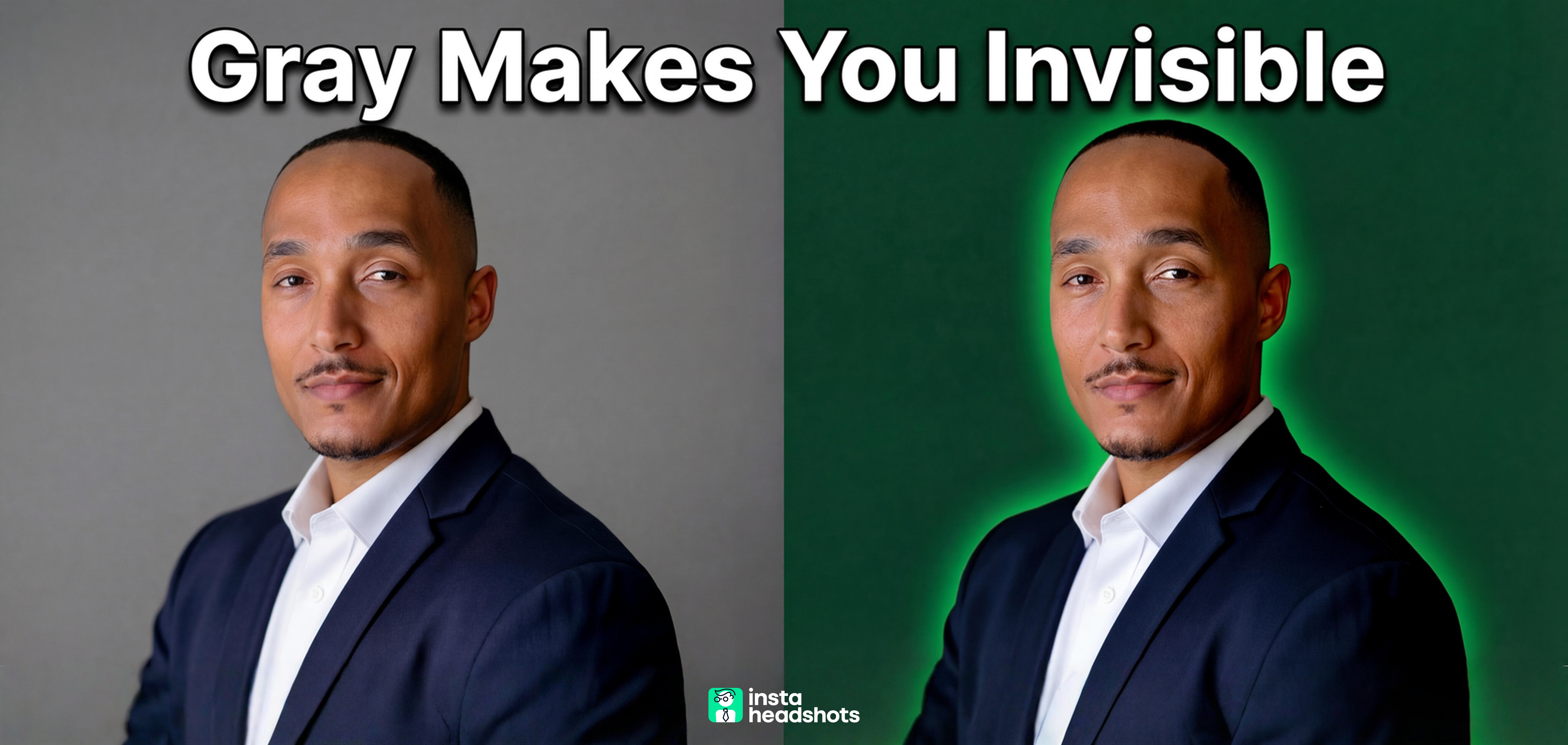
Here's what surprised me: the conventional wisdom about defaulting to plain gray is actually creating a sea of forgettable headshots. And the data suggests your background choice communicates more than you realize, often within 100 milliseconds of someone seeing your photo.
Whether you're prepping for a studio session or using AI tools, background selection is an underestimated credibility lever. I've broken down exactly which backgrounds work for different industries and contexts, plus the amateur mistakes that immediately signal "I didn't take this seriously." If you're confused about matching headshot backgrounds to your goals, this should clear things up.
Let me walk you through what I found.
The Quick Answer: Background Choice By Industry
Before I go deep on the psychology and technical stuff, here's the practical breakdown I wish I'd had when I started researching this:
| Industry | Best Background Options | What to Avoid |
|---|---|---|
| Finance/Consulting | Charcoal, navy, deep gray | Bright colors, busy offices |
| Legal | Neutral solids, subdued office | Editorial black (unless senior), cluttered shelves |
| Healthcare | Clean white, light blue, soft gray | Harsh "passport" white, clinical looks |
| Tech/Startups | Soft gradients, modern office bokeh, outdoor | Dated studio backdrops, overly formal |
| Real Estate | Environmental (skyline, architecture) | Generic studio, unrelated locations |
| Creative | Branded gradients, editorial looks | Plain gray (too forgettable) |
The pattern here is interesting. Finance and legal favor darker neutrals that signal stability. Healthcare needs clean, approachable backgrounds. Tech and creative fields can push boundaries with gradients and environmental settings.
Now let me show you why these patterns exist.
Why Your Background Isn't Just a Backdrop
I was skeptical too, until I looked at the numbers.
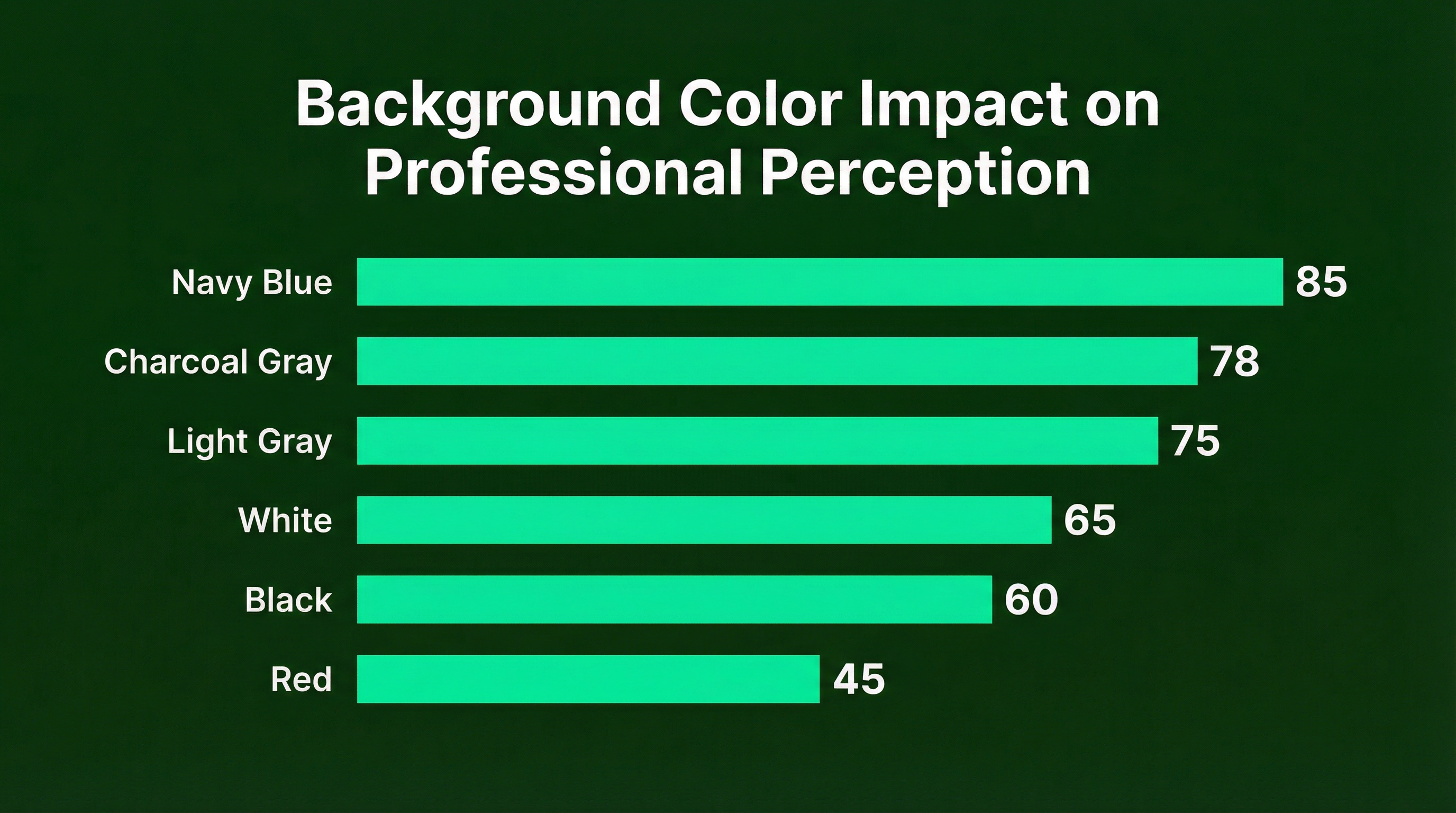
Research shows that 62 to 90 percent of snap assessments are based on color alone. That's before anyone consciously evaluates your expression, your outfit, or how trustworthy you look. The background is doing heavy lifting in that initial impression.
Here's the part that surprised me: color psychology isn't universal. Context matters enormously.
Blue consistently signals trust and competence. Navy conveys authority while lighter blues suggest approachability. This is why finance and tech executives gravitate toward it.
Red is tricky. Research shows it increases perceived dominance, but it can also read as aggressive. High risk, high reward. Unless you're going for a power editorial look, I'd skip it.
Gray remains the versatile workhorse. Light gray works almost everywhere. But here's the 2026 shift I'm seeing: darker grays and charcoals are trending because they frame the face better and add gravitas without the risk of black.
White is having a moment for "airy" editorial brands, but it's easy to get wrong. Without proper lighting, you end up with the harsh "passport photo" look that signals low effort.
The 7 Amateur Mistakes I Keep Seeing
Let me nerd out on this for a second. After reviewing dozens of headshot examples, patterns emerged. These mistakes scream "I didn't think this through."
1. The Harsh White "Passport" Look
Shadow directly behind the head. Blown-out highlights. It reads as clinical, cheap, or like a mugshot. The fix is simple: move the subject away from the wall and reduce background lighting.
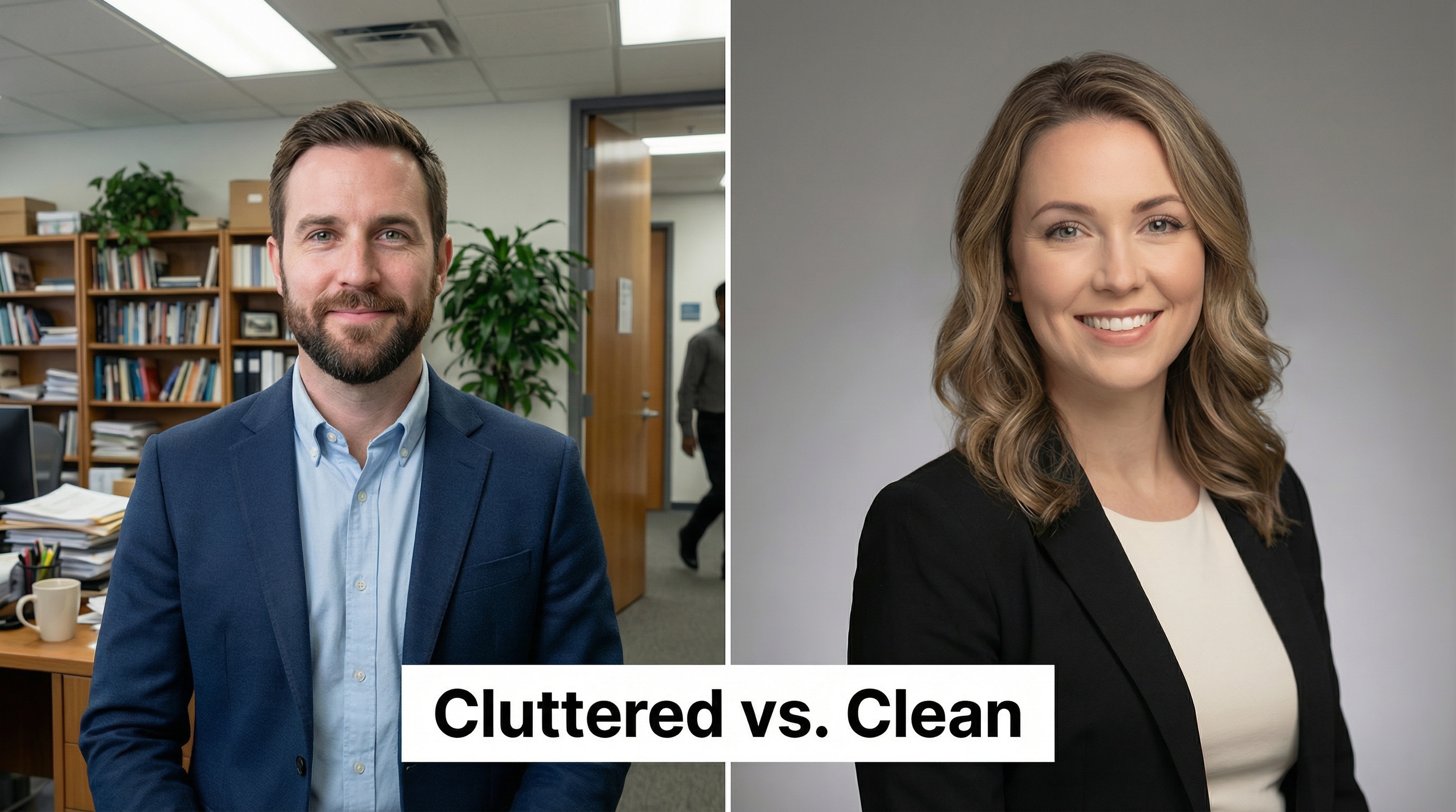
2. Busy or Cluttered Office Backgrounds
Bookshelves, plants, or coworkers clearly visible in focus. This signals lack of intentionality and pulls attention from your face. Use a longer lens (85mm or more) or move forward to blur the background.
3. Fake Bokeh and AI Halos
Sharp edges around hair and ears. Unnatural blur transitions. This instantly signals "cheap app filter" and erodes trust. Real optical blur from a camera lens has progressive depth. AI and smartphone portraits often apply flat blur that looks off.
4. Lighting Direction Mismatch
Subject lit from the left, background shadows falling the wrong way. This creates that subconscious "uncanny valley" feeling where something seems pasted in. If you're compositing backgrounds, the light direction must match.
5. Mixed Team Backgrounds
One person in studio, one outside, one in their office. This signals disorganization and hurts employer brand. For teams, standardize one or two background options.
6. Low Resolution and Compression Artifacts
Pixelation and blocky colors in the background. This says "I didn't care enough to check." Export at the correct resolution for your platform.
7. The Cropped Group Photo
Visible shoulders of others. Distracting background noise. Never use a cropped group photo for professional purposes. Just reshoot.
Studio vs AI: How Background Selection Differs
Okay, but here's where it gets interesting.
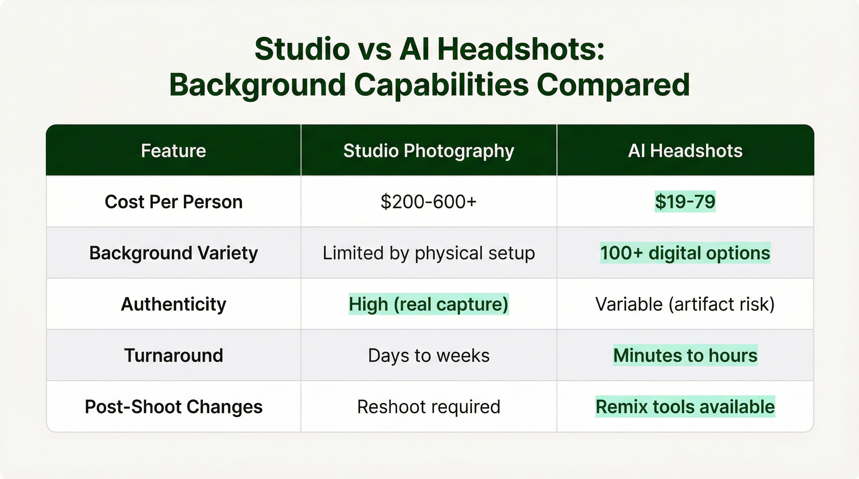
The way you select and control backgrounds differs dramatically between traditional studio photography and AI headshot tools. Both can produce professional results, but the approach and trade-offs are different.
Traditional Studio Advantages
Precise physical control. Real seamless paper or fabric backdrops. Lighting that naturally separates subject from background. No artifacts or fake bokeh issues. The photographer can add a "hair light" to create separation against dark backgrounds.
Gradient backgrounds work beautifully in studio. They add depth and a calm, soothing feel compared to flat solids. A good photographer creates these with a grid on the background light.
AI Tool Advantages
Massive variety. Many AI headshot services offer 100+ background styles. Some tools let you "remix" backgrounds without regenerating the face, giving you flexibility to create multiple versions from one session.
Cost efficiency is significant. AI tools typically run $19 to $79 compared to $200 or more for studio sessions. For remote teams needing consistent headshots, AI or hybrid approaches solve the "everyone looks different" problem.
AI Tool Limitations
The failure modes are specific and worth knowing. Common tells include artifacts where hair meets background, "melting" accessories like glasses, and lighting that doesn't match the background's direction. A 2024 JAMA study found significant demographic bias in some AI-generated physician headshots.
High-trust industries (finance, legal, healthcare) are increasingly scrutinizing AI-generated portraits. If you're in one of these fields, traditional photography or carefully vetted AI tools may be safer choices.
Services like InstaHeadshots offer 40+ professional styles with post-generation editing, letting you fine-tune backgrounds after the AI generates your base headshot. This hybrid approach gives you AI speed with some of the customization of studio work.
Environmental and Outdoor Backgrounds: When They Work
The conventional wisdom says outdoor backgrounds look unprofessional. The data says it's more nuanced than that.
Environmental backgrounds signal authenticity when they connect to your work. A real estate agent with a subtle city skyline? That makes sense. A tech founder with a modern office bokeh? Works fine. A financial advisor in front of random foliage? That's a mismatch.
The technical execution matters enormously here. Use 85mm to 105mm lenses. Keep 10 to 20 feet between subject and background. Shoot at f/2 to f/4 for that professional blur. Scout locations for "safe light" (open shade) and check for distractions like trash cans or signage.
If you're getting environmental headshots, the background should be intentionally blurred enough to not compete for attention, but recognizable enough to communicate something about your professional context.
The Platform Dimension: Same Photo, Different Requirements
Here's something I didn't consider until I started exporting headshots across platforms: the same background can look great in one context and terrible in another.
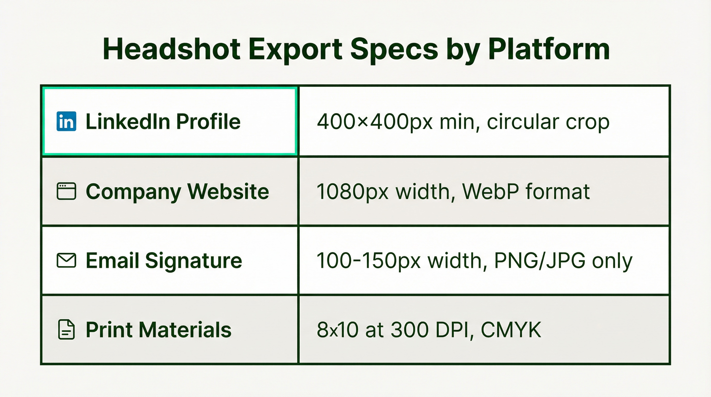
LinkedIn uses a circular crop. That means your background edges get cut off. Make sure your background works in a circle, not just as a rectangle. And leave enough "headroom" so the crop doesn't cut off the top of your head.
Company websites compress images. Use WebP format for speed. Keep file sizes under 500KB. For consistent team pages, use the same aspect ratio (4:5 works well) so everyone's photo aligns in grids.
Email signatures need tiny files. Under 50KB. Don't use WebP here because email clients handle it poorly. Stick with PNG or JPG.
Print is a different world. You need 300 DPI minimum and CMYK color space. Web images at 72 DPI will look pixelated when printed. Always request high-resolution files if you think you might need print later.
The 2026 Trend: Background Wardrobes
The research here is actually fascinating. The biggest shift I'm seeing is what photographers are calling the "background wardrobe" approach.
The idea: capture one high-quality, authentic studio portrait. Then place it into multiple brand-aligned backgrounds for different contexts. Dark neutral for LinkedIn. Branded office for the company website. Clean white for press features.
This solves the consistency problem for distributed teams while giving individuals flexibility. You're not locked into one background forever. You can adapt as your context changes.
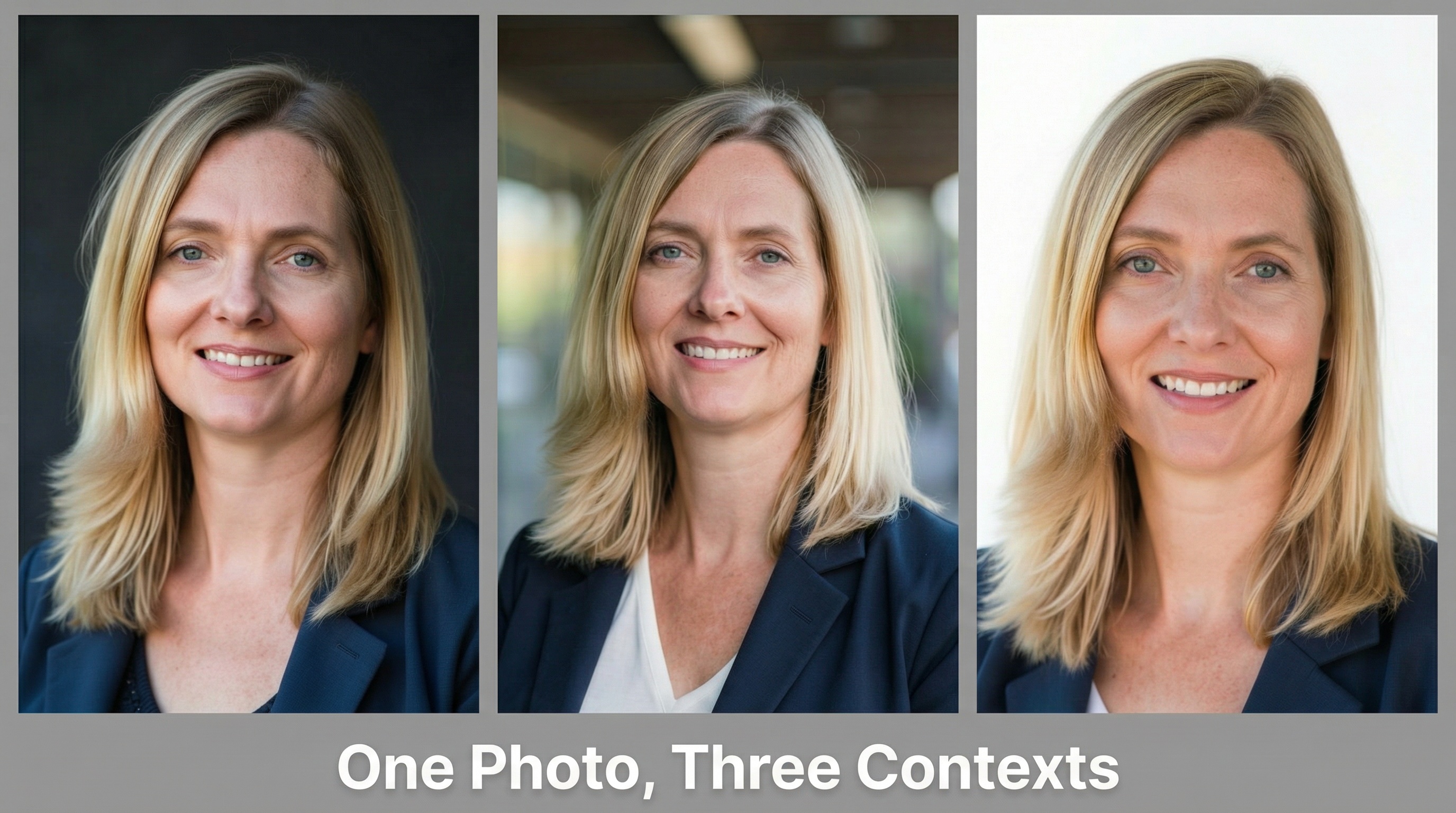
The other trend worth noting: darker neutrals are gaining ground. Charcoal and deep navy are replacing light gray as the default "safe" choice. These tones frame the face more effectively and convey more gravitas without the risk of pure black.
How to Choose: A Decision Framework
Let me pull this together into something actionable.
Step 1: Consider Your Industry Norms
What do the successful people in your field use? Not because you should copy them blindly, but because you're communicating within a professional context that has expectations. Deviating too far signals unfamiliarity or poor judgment.
Step 2: Consider Your Platform Mix
Where will this headshot live? If it's primarily LinkedIn, you need something that works in a circular crop against LinkedIn's interface. If it's your company website, match the visual style already there. If you need multiple uses, the "wardrobe" approach might make sense.
Step 3: Consider Your Personal Brand
Within industry norms, what distinguishes you? If everyone in your field uses gray and you want to signal approachability, maybe light blue. If you're in a creative field where gray would be forgettable, maybe a branded gradient.
Step 4: Match Method to Stakes
For C-suite executives and partner-level professionals, traditional studio photography is still the gold standard. The authenticity and quality are harder to question. For most professionals, AI tools provide excellent results at a fraction of the cost. For best background color choices, I recommend starting with your industry norms and adjusting from there.
The Bottom Line
Your headshot background isn't just filling space behind your face. It's communicating something about your professional identity, whether you intended it to or not.
The "play it safe with plain gray" advice creates forgettable headshots in a sea of forgettable headshots. Strategic background selection, whether that's a warm executive charcoal, a modern gradient, or a contextual outdoor setting, actively reinforces your credibility.
The key insight from all this research: in a LinkedIn feed or company website, you have milliseconds to signal competence and approachability. A thoughtfully chosen background does this subconsciously. A poorly chosen one immediately signals "I didn't take this seriously," even if viewers can't articulate why.
Choose intentionally. Match your industry, your platform, and your personal brand. And when in doubt, darker neutrals are safer than lighter ones for most professional contexts.
Now if you'll excuse me, I need to go update my own headshot background.