
Corporate Headshots Are a Signaling System, Not a Checkbox
Corporate headshots quietly signal hierarchy and brand cohesion. Here's how distributed teams build a consistent visual system in 2026 without a single studio day.

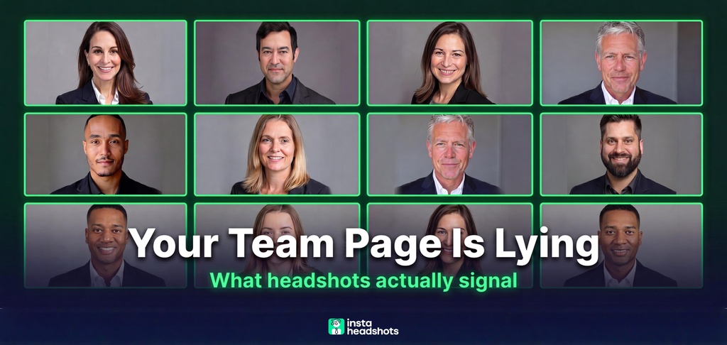
I was reviewing a client's About Us page last year when something snapped into focus. The CEO had a sharp, studio-lit portrait. The VP next to him was using a cropped photo from what looked like a wedding. Three rows down, half the team had selfies.
It looked like five different companies pretending to be one. And here's what got me: this was a 200-person company with serious revenue. The product was excellent. But the team page made them look smaller and less organized than they were.
That's when I started treating headshots differently. Not as a profile picture. As a signaling system that quietly tells people who you are, who's senior, and whether you have your act together.
If you run HR, internal comms, or People Ops at a distributed company, this is your problem to own. Here's everything I learned about turning a logistical headache into a brand advantage.
The Short Version: Two Systems, Not One
Let me give you the answer before the explanation.
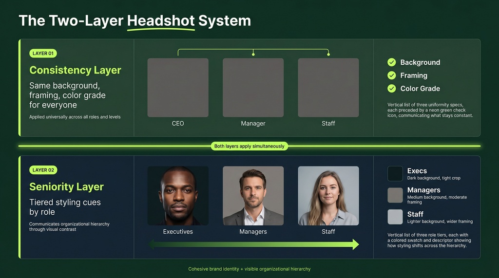
Great corporate headshot programs run two systems at once:
- A consistency layer. Every employee, regardless of city or time zone, shares the same background, framing, and color grade. This makes the team look unified.
- A seniority layer. Subtle styling cues (darker backgrounds, tighter crops, more formal attire) distinguish executives from staff without looking elitist.
Most companies have neither. They have a pile of photos taken at different times by different people. That's not a system. That's drift.
Here's the part that changed my thinking: viewers judge competence and trust in 100 milliseconds, before reading a single word. Your team page is making an impression whether you designed it or not.
Why the Old Model Broke
The traditional model was simple: book one photographer, pick one day, line everyone up.
That model assumed everyone was in the same building. It's dead now.
Around 22% of the US workforce works remotely, roughly 32.6 million people. And 60% of remote-capable employees prefer hybrid arrangements. You cannot get a team spread across three time zones into the same studio on the same day. It's not hard. It's impossible.
So people stop trying. New hires never get photographed. Someone uses a vacation photo. The VP's headshot is four years and one haircut old. The page becomes a patchwork.
This is a systems issue, not a discipline problem. When the process depends on synchronizing people who will never be in one room, it breaks by default. Most growth problems are structural, and this one is too.
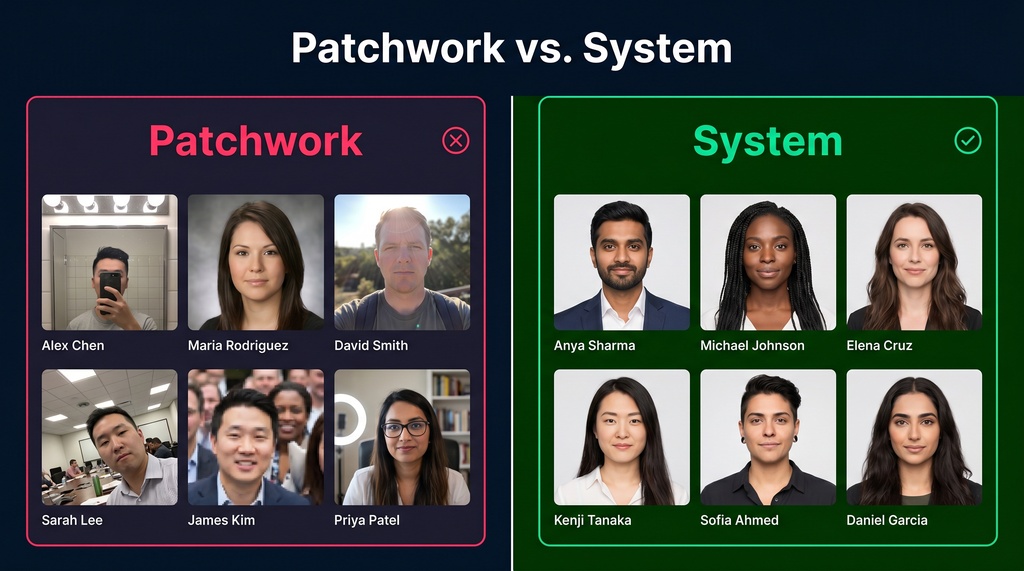
I dug into this exact failure mode in a piece on AI vs physical photoshoots. The short version: a sales team with photos from five shoots across four cities shows obvious mismatches that quietly signal disorganization.
How Headshots Encode Seniority
Here's the part most people miss. Hierarchy is visual. You can read it without being told.
In my research, five levers do the work:
| Lever | Executive Tier | Staff Tier |
|---|---|---|
| Background | Dark gray or deep navy | Light gray or white |
| Lighting | Dramatic (Rembrandt) | Flat, soft, even |
| Crop | Tight, chest up | Wider, relaxed |
| Attire | Dark suit | Smart business casual |
| Color grade | Cool, deeper shadows | Brighter, warmer |
Research backs this up. Corporate photography guides recommend a solid dark background for CEOs to convey stability and authority. Executives get more dramatic lighting to add definition and a serious tone. Staff look best with flat, inviting light.
The academic side is just as clear. A Rollins College study found that formal attire significantly increases perceived competence, and competence drives hireability more than warmth. Styling isn't vanity. It moves the needle on how people read authority.
The Trap: Don't Make Junior Staff Look Like Afterthoughts
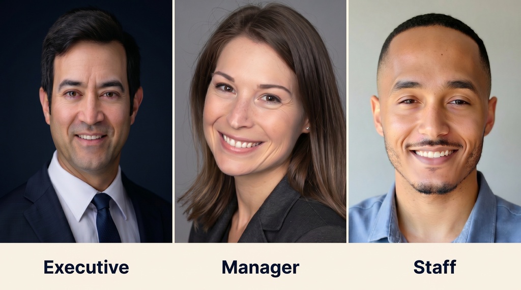
Here's the mistake. People style the C-suite carefully and let everyone else fend for themselves. That doesn't signal hierarchy. It signals neglect.
The fix: make every tier deliberate. When staff photos are intentionally styled for approachability, they signal role clarity, not lower status. Constraints create clarity. Give every level a spec and follow it.
There's a real tension to manage too. Making an executive look too approachable or salesy can undermine their authority. A subtle, confident smile usually wins. I go deeper on the styles that signal leadership in my guide to executive headshots.
The Spec Sheet That Makes It Real
A system without documentation is just a good intention. You need a spec sheet every photographer and employee can follow.
Here are the technical baselines I'd lock down:
| Parameter | Specification |
|---|---|
| Primary aspect ratio | 4:5 (8x10) |
| LinkedIn crop | 1:1, 400x400px minimum |
| Print resolution | 300 DPI, 2400x3000px |
| File format | JPEG for delivery |
| Eye position | 60-70% down the frame |
| Face coverage | About 60% of the frame |
That last one matters more than people think. Profiles where the face fills about 60% of the frame get the most engagement.
Then add the styling tiers from the table above, and assign a brand manager to review every image before it goes live. One person, one standard, one approval gate. Execution is a strategy.
Why This Is Worth the Effort
Let me make the business case fast, because someone will ask you to justify the budget.
LinkedIn profiles with professional photos receive 21x more profile views and 9x more connection requests. And 67% of recruiters say they won't message a candidate with an unprofessional photo.
Now multiply that across a 200-person team. Your headshots aren't just decoration. They affect recruiting, sales perception, and how investors read your maturity.
Inconsistent photos quietly erode all of it. Don't scale what you haven't stabilized: fix the visual baseline before you spend on anything fancier.
The Logistics Problem AI Actually Solves
This is where the math gets interesting.
A traditional multi-office program for 200 employees runs $15,000 to $50,000, takes weeks to coordinate, and still leaves new hires uncovered. AI headshot generation drops that to a fraction and delivers in hours.
Real examples back this up. One educational institution went from six weeks to two hours using AI, saving over 200 hours of staff time at a 90% cost reduction. The consistency layer is where AI quietly shines: it can enforce the same background, framing, and color grade across thousands of people who will never share a studio.
This is the part the old model couldn't do at all. Leverage beats effort.
The Honest Trade-Offs With AI
I'm skeptical of hype, so let me be straight about where AI falls short.
Quality isn't perfect yet. One Fortune 500 HR director found that 43 of 200 AI headshots (about 21.5%) failed an internal quality audit due to artifacts and inconsistent lighting. Details can wobble when you zoom into eyes or teeth. And there are real GDPR and CCPA questions about uploading employee photos to third-party servers.
So don't treat AI as a magic button. Budget for a manual review pass. Catch the 20% that miss.
The buck stops with whoever owns the program. That's the brand manager and the approval gate I mentioned earlier.
The Model I Recommend: Tiered Hybrid
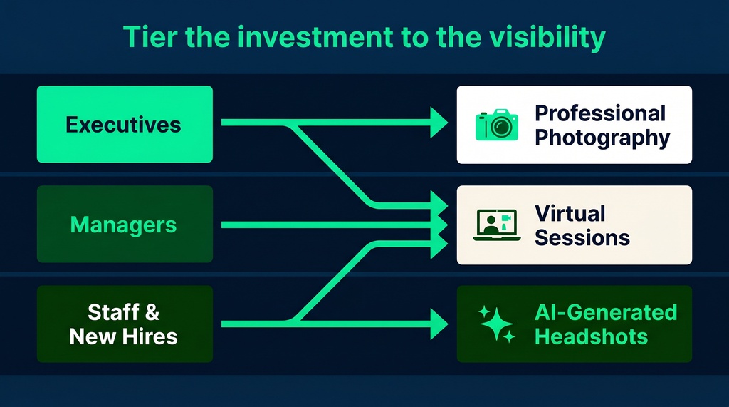
The best companies don't pick AI or photography. They tier the investment against how visible the role is.
Here's the structure I'd build:
| Role Level | Method | Why |
|---|---|---|
| C-suite & board | Professional photographer | Micro-expressions and nuanced lighting drive stakeholder trust |
| Client-facing VPs | Professional photographer | High-stakes external visibility |
| Mid-level managers | Virtual live photographer | Real-time direction, lower cost |
| All other staff | AI-generated | Volume coverage at 90%+ savings |
| New hires (interim) | AI placeholder | On-brand image on day one |
That last row matters. The cropped-wedding-photo problem disappears when new hires get an on-brand AI placeholder on day one, replaced at the next professional session. Treat headshots as an onboarding standard, not a periodic scramble.
For the AI-covered tiers, tools like Headshots by Magic Studio generate dozens of on-brand headshots from a few selfies in minutes, with commercial usage rights and team discounts. For executives at high visibility, I'd still book a photographer. Acknowledge the trade-off honestly: AI is great for breadth, photography wins on impact.
Keep It From Drifting Again
Getting consistent once isn't the win. Staying consistent is.
Without an enforced refresh cycle, remote teams drift right back into a mix of eras and quality. My research points to a 12 to 24 month refresh cadence on a centralized calendar so no office gets left behind.
Three things keep the system alive:
- A documented spec sheet handed to every photographer and employee
- A single brand manager who approves every image before it publishes
- Headshots built into onboarding, so the process is never "done"
That's the whole game. Build the two layers, write the spec, automate the volume with AI, reserve photography for high-visibility roles, and refresh on a schedule.
Your team page is a first impression you're making thousands of times a week. Design it on purpose.