
LinkedIn Background Photo: The Layout Problem No One Talks About
Your LinkedIn background photo isn't decoration. It's a layout problem. Here's the exact size (1584x396), the safe zone map, and banner ideas by profession.

Most people treat their LinkedIn banner like wallpaper. They grab a city skyline, slap it on, and move on. Then they wonder why it looks off on their phone.
I run growth across several AI imaging products, and I've watched thousands of professionals struggle with this exact thing. The banner looks great on a 27-inch monitor. Then half the text vanishes on mobile. The problem isn't taste. It's structure.
If you're a job seeker, consultant, or anyone trying to look intentional, this matters. A default grey banner signals an incomplete profile. A cropped one signals carelessness. Neither helps you.
Here's everything I learned about getting your LinkedIn background photo right. The exact specs, the safe zone, and how to make it actually work with your headshot.
The Exact LinkedIn Background Photo Size (Start Here)
The LinkedIn personal profile background photo is 1584 x 396 pixels. That's a 4:1 aspect ratio. Max file size is 8 MB. Use JPG, PNG, or static GIF.
Don't guess. Don't scale from another image. Design at exactly 1584 x 396 px or you'll get blur and bad crops.
Here are the specs in one place:
| Spec | Personal Profile | Company Page |
|---|---|---|
| Dimensions | 1584 x 396 px | 1128 x 191 px |
| Aspect Ratio | 4:1 | ~6:1 |
| Max File Size | 8 MB | 8 MB |
| Formats | JPG, PNG, static GIF | JPG, PNG |
| Retina (2x) | 3168 x 792 px | Not specified |
This 1584 x 396 spec is confirmed across sources updated for 2026. A few quick technical notes:
- Use 72 DPI. Higher DPI does nothing for LinkedIn rendering.
- Use sRGB color. LinkedIn converts CMYK and shifts your colors.
- WEBP and HEIC files trigger a "Save failed" error. Convert first.
If your banner keeps coming out blurry, design at 2x (3168 x 792 px), then export down to 1584 x 396. High-density screens need the extra resolution.
That's the whole answer to "what size is a LinkedIn banner." Everything below is about making it actually land.
Why Your Banner Looks Broken (The Safe Zone Problem)
Here's the part most advice skips. LinkedIn renders the same image differently on desktop, mobile, and tablet. A "beautiful" banner often fails because the message lands in a dead zone.
Most growth problems are structural. This is no different.
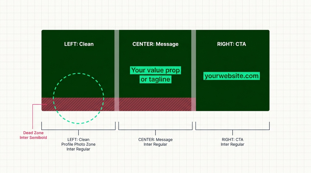
On desktop, you see the full 1584 x 396 image. But your circular profile photo overlaps the bottom-left corner. That covers roughly a 200 x 150 px area.
Mobile is more aggressive. It crops about 117 px from each side and 83 px from top and bottom. Your visible area shrinks to roughly 1350 x 230 px. Worse, the profile photo shifts to bottom-center, creating an even bigger overlap.
Sources disagree on exact safe-zone numbers. They range from 1100 x 220 px up to 1400 x 300 px. But they all agree on one thing: the bottom-left is a dead zone.
Here's the consensus I'd trust:
- Mobile-safe zone: roughly 1350 x 230 px, centered, upper-center of the canvas.
- Text-safe zone: roughly 1000 x 250 px, in the right-center.
- Keep the left third clear of text entirely.
One more thing on the #OpenToWork badge. It's a green ring around your profile photo, not an overlay on the banner. But it draws extra eyes to that bottom-left zone. So design as if the bottom-left doesn't exist.
Constraints create clarity. Once you accept the safe zone, design gets easier, not harder.
The Three-Zone Rule That Makes Banners Work
Stop scattering content across the canvas. Use three zones. This framework comes from HyperClapper and it's the cleanest mental model I've found.
- Left zone: Keep it clean. Your profile photo lives here.
- Center zone: Your primary message. Value prop, tagline, or role.
- Right zone: Your call to action. A URL or contact line.
Then apply the two-second rule. Your banner should communicate your niche in two seconds. Use industry visuals, a branded tagline, or social proof like press logos.
A few rules I'd treat as non-negotiable:
- High contrast. Light text on dark backgrounds. Bold dark text on light ones. It has to read on a phone.
- Simplicity wins. Don't overcrowd. Simple designs outperform busy ones.
- Pick 2-3 colors. Random palettes look thrown together.
A designer named Milovan Mitrovic documented his banner redesign on Medium. He used a dark base, light-tinted text, and planned the whole composition around where the profile photo overlaps. His takeaway matches mine: treat the banner as a layout problem, not an art project.
Banner Ideas by Profession
Generic stock photos are invisible. A skyline, a laptop, a handshake: everyone uses them, so they say nothing. Banners that could belong to anyone belong to no one.
Match your banner to your role instead. Here's what works, pulled from Zapier's banner research and Figma.
| Profession | Banner Idea |
|---|---|
| Software Engineer | Code snippet or tech stack, dark theme |
| Data Analyst | Upward trend graphs, bold colors |
| Graphic Designer | Showcase of your own work |
| Photographer | One striking photo you took, minimal text |
| Real Estate Agent | Local skyline or landmark, contact in right zone |
| Coach / Consultant | Speaking photo, tagline, credentials |
| Healthcare | Care imagery, soft blues and greens |
| Attorney | Cause or belief imagery, dignified palette |
| Student / New Grad | Campus landmark, degree, "Open to..." text |
| Freelance Copywriter | A row of client brand logos |
| SaaS Professional | Product screenshot, value prop |
Color sends a signal too. Finance, education, and healthcare should lean on soft palettes: light blues, gentle greens, light greys. They read as trustworthy. Creative roles can go bolder. Tech often favors dark themes that echo their dev environment.
The same logic applies to your headshot backdrop. I covered how to match your background to your industry in a separate guide, and the same principle carries straight into banner design.
Make Your Headshot and Banner Look Like a Set
This is where most profiles fall apart. The headshot and banner look like they came from two different planets. The fix is cohesion.
And cohesion matters more than people think. One analysis found that 76% of recruiter attention goes to your photo and background image combined. That's three-quarters of their focus on visuals. The banner is a measurable factor, not decoration.
The profile photo itself does heavy lifting too. Profiles with professional photos get 14 to 21x more views and up to 36x more messages. So when the two visuals fight each other, you're wasting that lift.
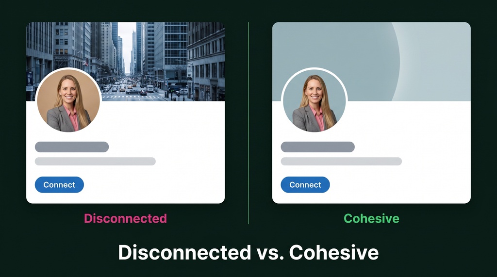
Here's how to tie them together:
- Color-sample from your headshot. Pull the shirt or background color and use it as your banner's main or accent color.
- Plan a neutral zone. The area behind your profile circle should be a solid color or a soft blur. The transition should feel seamless.
- Use a consistent filter if your banner has multiple images.
The cleanest move is to refresh both at the same time. If you're already updating your headshot, pick one with a background color you can carry into the banner. Neutral, non-distracting backgrounds keep the focus on you, a principle that drives profile views and translates directly to banner design.
This is also where AI headshots fit naturally. Tools like Headshots by Magic Studio produce clean, consistent backgrounds you can color-match against. A full refresh runs $49-$69 for the headshot versus $250-$500 for a traditional photoshoot. The Basic tier gives you 100 photos across 5 styles, so you can choose a background that informs your whole palette.
One honest caveat: about 38% of recruiters say they can flag AI headshots as artificial. So pick the most natural-looking output, not the most polished-looking one. The banner doesn't carry that risk, which makes the cohesion strategy even more valuable. The banner reinforces the impression your headshot sets.
Common Mistakes to Fix Today
I see the same errors over and over. Here's a fast checklist.
| Mistake | The Fix |
|---|---|
| Default blue background | Upload any custom banner now |
| Wrong dimensions, blur | Design at 1584 x 396, or 2x for retina |
| Text in the bottom-left | Keep it in the center-right safe zone |
| Generic stock photo | Use profession-specific visuals |
| Too much text | One tagline, one CTA, use whitespace |
| Clashing colors | Pick 2-3 colors, sample from your headshot |
| WEBP or HEIC file | Convert to JPG or PNG |
| Only checking desktop | Always preview on mobile |
That last one is the killer. Most LinkedIn traffic is mobile. If you only check desktop, you're flying blind on the screen most people will actually use.
The wrong dimensions cause the same headache as a badly cropped headshot. I dug into that parallel in my guide on headshot dimensions and ratios, because platforms crop based on shape, not file size. Choose the right ratio up front or lose the details that matter.
The Takeaway
Your LinkedIn background photo is free, prime real estate. At 1584 x 396 px with a known safe zone, you can show exactly who you are and what you do.
Don't scale what you haven't stabilized. Lock the spec first. Then design for the mobile safe zone. Then make it match your headshot. In that order.
The banner isn't an art project. It's a layout problem with a known solution. Solve it once, and you get a profile that looks intentional instead of accidental. Leverage beats effort, every time.
Go check your profile on your phone right now. If the message lands in a dead zone, you've got your weekend project.